Data viewers
curios.IT currently offers 18 different data viewers:


Basic Statistics
The basic statistics viewer displays the following information:
For each numerical column/field:
- Minimum, maximum
- Average and standard deviation OR median and lower and upper quartiles (shown as discs)
- A histogram which shows the distribution of values
Histogram segments can be selected to show their content (or select the records in the corresponding value range as subset). This feature is not available on the mobile/tablet platforms.
The view can be scrolled horizontally by dragging with the mouse.
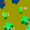
Correlation Matrix
This viewer shows the correlation (pearson correlation coefficient) for each combination of numerical columns/fields. The higher the bar, the higher the (positive or negative) correlation between the fields.
From Wikipedia:
The Pearson correlation is +1 in the case of a perfect positive (increasing) linear relationship (correlation), -1 in the case of a perfect decreasing (negative) linear relationship (anticorrelation), and some value between -1 and 1 in all other cases, indicating the degree of linear dependence between the variables. As it approaches zero there is less of a relationship (closer to uncorrelated). The closer the coefficient is to either -1 or 1, the stronger the correlation between the variables.
If the variables are independent, Pearson's correlation coefficient is 0, but the converse is not true because the correlation coefficient detects only linear dependencies between two variables.
Data Density (all)
The data density viewer is a novel tool to gain insight into the distribution of data. For each space direction a column/field can be selected. The numeric value range of each field is then divided into 11 intervals and each record is assigned to an interval for each field. If records are present for a combination of intervals, a cube is drawn at the location of the intervals. The size of the cube depends on the number of records found in the intervals. The resulting chart allows you to identify outliers and regions with high record density.
Depending on the data, the chart can be crowded. To ignore small cubes with only a few records, a minimum of records/cube can be selected. Conversely (e.g. to focus on outliers) it is possible to specify a maximum of records/cube. This will ignore large cubes. By setting both minimum and maximum it is possible to focus on special (but not too unique) value combinations.
By clicking on a cube the contained records can be explored (e.g. by selecting them as new data set).
The data density viewer can be run in Iso-surface mode (default). In this case a surface of constant data density is drawn. It is possible to specify the approximate percentage of data the Iso-surface should enclose. The surface will then enclose the region of data space with the highest density (most typical data). This offers an easy way to remove outliers: an Iso-surface showing e.g. 75% of the data is drawn and the resulting visible subset is selected as the new data set (yellow 'Visible' button). By setting the % slider to low values it is possible to identify cluster centers. Note that the Iso-surface is based on the cubes calculated (see above). Therefore the percentage of data shown can be set only to values which result from removing a certain number of cubes (with the same number of records/cube).
It is possible to collapse a dimension to a constant value by unchecking the checkbox next to the dimension name (e.g. 'Right'). In this case a 2 dimensional density plot is created (it makes sense to watch them with orthographic camera setting).
Data Density (groups)
This viewer is very similar to the other data density viewer, but is designed to compare groups. A grouping method must be selected in the top pulldown menu. The data distributions (in the data space defined with the field selection pulldowns) for each group are then drawn as ISO-surfaces. The surfaces are shown as grids to show possible overlap.
It is possible to deactivate one or several groups. This is especially useful if there is a lot of overlap between the groups and the resulting chart is crowded.
Again it is possible to reduce the percentage of data enclosed by the surfaces. Note that - especially for small data sets - the ISO-surfaces for different groups might enclose different percentages of the group (unless 100% is selected). So this feature should be mainly used to identify group centers.
It is possible to collapse a dimension to a constant value by unchecking the checkbox next to the dimension name (e.g. 'Right'). In this case a 2 dimensional density plot is created (it makes sense to watch them with orthographic camera setting).
Distributions
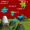
This viewer allows to compare data distributions of a numeric column/field for different groups. A grouping method and a numerical column/field must be selected in the top menu. Then a chart is drawn which compares the distributions of values of this field for the different groups: for each group, a plant with 6 flowers is drawn (bottom blue for lowest values to top red with highest values).
The plants are arranged on a landscape where groups/plants with similar data distributions are put close together while those with different distributions are further apart. Not that the necessary dimension reduction process (from the 6 dimensional histogram space to the two dimensions of the terrain surface) is not guaranteed to work well in any case. Each plant is drawn on a small hill which has a height corresponding to the number of records in the group.
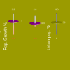
Pivot, Bars
This viewer is a classical bar chart viewer with versatile grouping options. One or two grouping options can be selected (if the data should be only grouped in one direction/dimension, set one grouping option to 'All'). It is possible to display relations of up to 4 variables using this viewer.
The height of the bar can be either
- The number of records in the group / combination of groups
- The average of a numeric column/field of all the records in this group / combination of groups
- The sum of a numeric column/field of all the records in this group / combination of groups
The color of the bars can be chosen to show either
- The group colors of the groups chosen in the 2 grouping options (the color coding will then depend on the angle of view)
- A color coding blue/min-red/max for the number of records in the group / combination of groups
- A color coding blue/min-red/max for the average of a numeric column/field in the group / combination of groups
- A color coding blue/min-red/max for the sum of a numeric column/field in the group / combination of groups
- The color coding of a 3d grouping: the color of the dominant group in the records the group / combination of groups
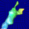
Metaphoric 2D
This viewer is displaying data groups as 3d models which can display up to 13 numerical variables at the same time. For each group, a tree is drawn. The tree can display 13 different visual features such as foliage height, stem width etc.. The assignment of data columns/fields to visual features can be configured by clicking on the 'Configure tree' button.
Configuration
In the 'Configure tree' dialogue it is possible to specify for each visual feature:
- If it is used or not (if it is not used, the visual feature is set to a constant medium value)
- Which numeric field/column is assigned
- If the assignment is inverted (e.g. large width of foliage drawn at low values)
As the tree is an object which offers many symbolic interpretations, it is usually possible to assign data fields to visual features in a way which can be easily remembered. Some visual features tend to be less visible for certain combinations of values, therefore they should be used for less important fields.
Landscape with metadata
Each tree is drawn on a small hill which has a height corresponding to the number of records in the group and a width roughly proportional to the variance in the hill (i.e. indicating if the group contains rather similar or rather different records).
The trees are arranged on a landscape where groups/trees with similar values (including all numeric fields, i.e. close distance in the high dimensional data space) are put close together while those with different values are further apart. Note that the necessary dimension reduction process (from the high dimensional data space to the two dimensions of the terrain surface) is not guaranteed to work well in any case.
Scale modes
The viewer offers 2 methods for scaling:
- Smallest = Min: The scale starts at the minimum value of all groups. This will enlarge even small differences between the groups. But note that the visual features are not proportional to the numerical values.
- Smallest = 0: The scale starts at 0. This will show trees with similar features if the differences between the groups are small. Visual features are roughly proportional to the numerical values
Pivot (metaphoric)
This viewer is a combination of the concepts found in the bar chart viewer and the multivariate tree viewer. Data can be split into groups in the same way like in the bar chart viewer but data is displayed as a multivariate tree, box, or tube. The assignment of data columns/fields to visual features of the tree / box / tube can be configured by clicking on the 'Configure tree' button.
Configuration
In the 'Configure tree'/'Configure box'/'Configure tube' dialogue it is possible to specify for each visual feature:
- If it is used or not (if it is not used, the visual feature is set to a constant medium value)
- Which numeric field/column is assigned
- If the assignment is inverted (e.g. large width of foliage drawn at low values)
As the tree is an object which offers many symbolic interpretations, it is usually possible to assign data fields to visual features in a way which can be easily remembered. Some visual features tend to be less visible for certain combinations of values, therefore they should be used for less important fields.
The box object offers a very good visual separation of features and is well suited if data is studied over a longer time period and the time required to remember the configuration is therefore not an issue.
Scale modes
The viewer offers 2 methods for scaling:
- Smallest = Min: The scale starts at the minimum value of all groups. This will enlarge even small differences between the groups. But note that the visual features are not proportional to the numerical values.
- Smallest = 0: The scale starts at 0. This will show trees with similar features if the differences between the groups are small. Visual features are roughly proportional to the numerical values
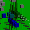
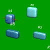
Metaphoric 3D
This viewer is displaying data groups as 3d models which can display up to 9 numerical variables at the same time. For each group, a box is drawn. The box can display 8 different visual features such as width, depth etc.. The assignment of data columns/fields to visual features can be configured by clicking on the 'Configure box' button. There it is possible to specify for each visual feature:
- If it is used or not (if it is not used, the visual feature is set to a constant medium value)
- Which numeric field/column is assigned
- If the assignment is inverted (e.g. large width drawn at low values)
The boxes are arranged in 3d space where groups/boxes with similar values (including all numeric fields, i.e. close distance in the high dimensional data space) are put close together while those with different values are further apart. Note that the necessary dimension reduction process (from the high dimensional data space to the three dimensions of visible space) is not guaranteed to work well in any case.
Pivot, Categories
This viewer allows to show the distribution over categories for a number of data groups. One or two grouping options and a category column/field must be selected.
Note that grouping by 2 dimensions/groupings often results in crowded charts and works best if used with histogram grouping.
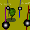
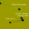
Linear Regression
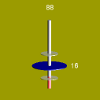
This viewer lets you play with a variable to see how the other variables change, based on a linear regression model. If you move one sphere with the mouse, the other spheres will move up or down (positive or negative direction) according to the data. The unit is +/- one standard deviation for each column/variable.
Statistics shows, that the linear regression change rate in units of the standard deviations corresponds to the correlation coefficient. Therefore the linear regression viewer is showing the same information as the correlation viewer, just presented in a different way.
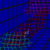
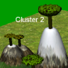
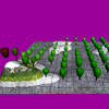
SOM (Self Organizing Maps) / U-Matrix
This viewer displays a landscape built from a self organizing map with u-matrix. The SOM algorithm tries to fit a square nxn (n is chosen depending on the number of records in the data set) grid into data space in such a way that the grid forms a representation of the data. The result is a map of the data, where neighbouring grid points represent similar data records. Each grid point is shown as a tree or box with the visual features configured from the average values of the data bound to it (records which are closest to this grid point).
The height of each grid point in the landscape corresponds to its average distance to the neighbouring grid points (unified distance matrix). This means that low trees represent areas with high record density ("city" textures) and high trees represent areas with low record density (e.g. outliers, "mountain" textures).
In this viewer it is often possible to identify cluster structures (note: standard centroid based cluster grouping like k-Means will always find clusters, even if there is no cluster structure present in the data): if you see two "valleys" of low lying trees separated by a "mountain ridge" (typically without trees, i.e. empty SOM cells which correspond to large empty distances in data space), this indicates that there are two clusters in the data. Similarly more complex cluster structures can be identified.
Note: For performance reasons, the number of grid points is reduced in the tablet versions.
Single Variable
This viewer allows you to compare groups regarding a single numerical variable. For each group the min., max. and the average are shown. Groups are sorted by the average.
Distances (metaphoric)
This viewer will give you an approximate understanding of the distances in data space between different groups. In general, projecting a high dimensional set of objects /coordinates into 3D space will not preserve distances between the objects (the phenomenon is known from the projection of the 3D world sphere onto 2D maps). Therefore this viewer tries to find an approximate solution with one group in focus: The distances from the group in focus to all the other groups are accurate, but the distances between the groups not in focus are only as accurate as possible.
By choosing different groups as the group in focus, this viewer will give you an intuitive feeling for the similarities between the currently configured groups.
Table (num.)
This viewer lets you view the current data subset as a table. Slide with fingers(tablet) or mouse(PC) to scroll rows/columns.
Scatter Plot 2D/3D
This viewer lets you view the current data subset as a 3d scatter plot. After selecting the columns/variables to be used for the plot, records are shown as small cubes. You can click on the cubes to identify (or select as one record subset) the corresponding record. This viewer is limited to 1500 records. If your data subset is too large for this viewer, select a smaller random subset first.
Correlation Network
This viewer displays the correlation network of the datasets columns/variables in 3d. You can find out, which variables are correlated (spheres close in 3d space) or anticorrelated (far). Each sphere is connected to its nearest neighbour with a line. You can select a sphere (resp. column/variable) as center element: the distance of each other sphere to the center element is accurate while the distances between other elements is only approximately correct (dimension reduction).
Differences to Parent
This viewer shows the basic statistics of a data set (min, max, average) compared to the values of the parent data set. If you create a subset of a data set (e.g. by using one of the tools on the left side) the original data set is called the parent.